Call-to-Action: Small Buttons That Decide Website Inquiries
Many small business websites explain services properly but leave visitors alone at the decisive moment. The prospect thinks: “Sounds good — what now?” That is exactly where the call-to-action decides whether interest becomes an inquiry or the next competitor gets opened.
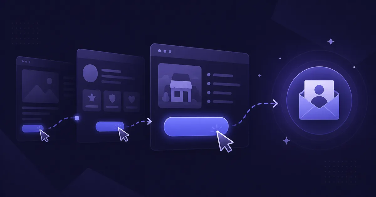
What is a call-to-action on a website?
A call-to-action, or CTA, is the clear prompt on a website: call, request a quote, book an appointment, schedule a callback or submit a form. For small businesses it is not a marketing gimmick. It is the signpost to the next useful step.
The visitor’s perspective matters. Few people like clicking “Submit” because the word only describes the technical action. Better copy names the benefit or next step: “Request a free assessment”, “Send appointment request” or “Schedule a callback”. The button removes uncertainty instead of merely adding color.
Which CTA button texts work for small businesses?
Good CTA copy is specific, short and realistic. It does not promise “100 new customers overnight”; it explains what happens after the click. A trades business needs different wording than a beauty salon or tax advisor. The important point is that visitors understand whether they are starting a quote request, an appointment or a non-binding conversation.
Practical examples for local businesses:
- Trades: “Request a free quote”, “Describe your project briefly”, “Get a callback from the specialist”
- Practice or salon: “Send appointment request”, “Book online”, “Ask for an available slot”
- Consulting: “Schedule an initial call”, “Describe your case”, “Get a non-binding assessment”
- Restaurant or local service: “Reserve a table”, “Plan route”, “Call today”
- Website project: “Request website quote”, “Check subscription model”, “Clarify budget range”
Where should a call-to-action be placed?
A CTA belongs wherever the visitor may be ready for the next step — not only at the bottom of the contact page. On the homepage, one main button should appear in the first visible area. On service pages, CTAs belong after the explanation, after references and at the end. On longer pages, an additional middle CTA is useful.
On smartphones, placement matters even more. Local searches often happen on the go or between appointments. Phone number, contact button or booking link must be reachable with a thumb. If visitors have to zoom, scroll and search, the chance of an inquiry drops. Mobile user experience has been emphasized by Google for years; for inquiries it is not only an SEO topic but a revenue topic.
How many CTAs make sense on one page?
The common mistake is not too little design, but too many equally loud options. “Buy now”, “Subscribe”, “Download PDF”, “Contact”, “WhatsApp” and “Learn more” compete on the same page. Visitors feel decision stress. For small businesses, one primary goal per page is usually better.
That does not mean there can be only one button. It means there is one primary CTA and supporting contact paths. Example: on a service page, “Request a quote” is the main button. Phone and email remain visible, but they do not visually compete with five other actions. This clarity is a core principle of conversion optimization.
What needs to happen after the click?
The best button does little if the next step is a form with ten required fields. For first contact, three inputs are often enough: name, contact method and request. Details such as budget, dimensions, documents or preferred date can remain optional or be clarified later. Baymard Institute has shown for years how long and complicated e-commerce processes lead to abandonment; the same logic applies to inquiry forms.
Users also need reassurance after the click. Show a clear confirmation: “Your inquiry has arrived. We usually respond by the next business day.” An automatic email with the same information is even better. If people receive no feedback at all, they often ask competitors in parallel.
Which CTA mistakes cost inquiries?
Many CTA problems look small but regularly cost contacts. Typical issues are weak words such as “More”, “Next” or “Submit”, buttons with poor contrast, phone numbers that are not clickable, hidden contact pages and forms that were never tested on mobile. A button that looks like normal text is easily missed.
Another mistake is asking for too big a commitment. A first-time visitor may not want to “Buy” immediately, but may want an assessment first. Low-threshold CTAs often work better: “Clarify budget”, “Ask a question”, “Schedule callback”. At bezahlbare-webseite.de this matters in subscription consulting: Starter from €79, Business from €149 and Premium from €299 per month are easier to understand after visitors describe their needs.
How can you test CTAs without expensive tools?
Start with a simple self-check. Open your key pages on a smartphone and ask: within five seconds, do I see what I should do? Is the button clear? Do I understand what happens after the click? Can I start the inquiry with one hand? If any answer is no, there is work to do.
Then measure pragmatically: how many clicks go to phone, email, form or booking link? Do more inquiries arrive after a change? Small websites do not need a big A/B testing system right away. Privacy-friendly analytics and a clean list of real inquiries are enough. If nobody adjusts this internally, a managed website subscription can make sense — not as a trick, but because CTAs improve with real customer data.
Frequently asked questions
What is a good CTA button example?
+How many calls-to-action does one page need?
+What color should a CTA button be?
+Should the CTA lead to a form or a phone number?
+How quickly can a better CTA bring more inquiries?
+Website subscription — from €79/month
Custom web design, German hosting, maintenance and personal support in one monthly package.
Book a free consultation