Responsive design: one website for every device
Many customers do not see your website first on a large screen. They find you on a phone while travelling, comparing providers or looking for a quick contact option. If text is tiny, buttons move or the menu is hard to use, trust is lost before the first conversation.
What does responsive design mean?
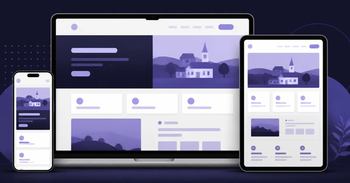
Responsive design means that a website automatically adapts its layout, images, spacing and navigation to the screen size. It is not a separate phone website. It is one flexible website that works on smartphones, tablets, laptops and large monitors. The content stays the same, but the presentation changes.
This matters for small businesses because customers use different devices for different tasks. One person checks your phone number on a mobile, another reads your services on a tablet, and a business client may later compare providers on a desktop. Responsive web design helps all of them reach the goal without zooming or guessing.
Why does mobile use matter for business websites?
In Germany, official statistics have treated mobile internet use as a normal part of private IT use for years. In practice, mobile search is not a special case anymore. Local searches such as “hairdresser near me", “emergency electrician" or “physiotherapy appointment" often happen on the move.
For self-employed people and small companies, poor mobile usability has a direct cost: fewer calls, fewer forms submitted and fewer bookings. A visitor who cannot quickly find opening hours or the enquiry button rarely waits. They return to Google and click the next provider.
Which elements must work on mobile?
Responsive design is more than making everything smaller. The key is usability. Phone number, enquiry button, menu, services, prices and examples must be easy to use with a thumb. Text needs readable sizes, images must not cover the whole first screen, and forms must be simple to complete.
A good mobile layout prioritises. On desktop, a home page can show several columns and extra information. On a phone, the first questions are simpler: who are you, what do you offer, where do you work and how can the customer contact you? Everything else can follow below.
- visible phone number or contact button
- simple menu with clear service pages
- readable text without zooming
- forms with few fields and large inputs
- images served in mobile-friendly sizes
What does Google say about mobile-friendly websites?
Google documents mobile-first indexing: for crawling and indexing, Google mainly looks at the mobile version of a page. This does not mean responsive design guarantees top rankings. But if important content is missing or difficult to use on mobile, both users and search engines have a harder time.
It becomes risky when the mobile version shows less content than desktop. Some older websites hide services, reviews or contact options on small screens. Then Google may effectively see the weaker version. Responsive design should keep the same important information accessible, not just shrink the page.
How can you check your website in five minutes?
The quickest test is your own smartphone. Open the home page on mobile data, not only on fast office Wi-Fi. Can you understand the offer within ten seconds? Can you find the phone number, contact form or booking link without searching? Is the menu clear? Does anything jump while loading?
Then use free tools such as Google PageSpeed Insights or the mobile reports in Search Console. Do not focus only on scores. Look for practical warnings: oversized images, text too small, clickable elements too close together, layout shifts or slow loading.
- open home page, service page and contact page on a phone
- look for phone number and enquiry path without excessive scrolling
- fill in a form as a test
- check images and buttons for layout jumps
- also view the site on a tablet or narrow browser window
What does responsive web design cost?
Costs depend on whether an existing site needs repairs or a clean rebuild. Small fixes may be affordable if the design and technology are still modern. With old themes, overloaded page builders or fixed-width layouts, a relaunch is often more economical than many hours of patching.
At bezahlbare-webseite.de, responsive implementation is part of the website subscriptions: Starter from 79 euros per month, Business 149 euros and Premium 299 euros per month. Local SEO can be added from 69 euros. Booking or shop functions are available as add-ons, for example booking from 149 euros or shop from 249 euros.
When is an update enough and when do you need a relaunch?
An update is enough when only individual elements break: an oversized image, a form, a button or spacing. A developer can then correct CSS, image sizes and components. Afterwards the site must be tested across several screen widths, not only on one phone model.
A relaunch makes sense when the entire site was built for desktop only: fixed widths, small text, tables, old plugins, slow loading and no clear mobile concept. A clean rebuild often saves time, reduces maintenance risk and makes future changes easier.
Frequently asked questions
Is responsive design mandatory?
+Do I need a separate mobile website?
+Can an old website be made responsive?
+Does responsive design help SEO?
+How do I recognise poor mobile usability?
+Website subscription — from €79/month
Custom web design, German hosting, maintenance and personal support in one monthly package.
Book a free consultation