Is your website accessible? The 5-minute quick check
Accessibility may sound like a public-sector topic, but for small businesses it is very practical: can every visitor read, operate and understand your website? This quick check shows where your site may lose enquiries and where legal relevance can arise.
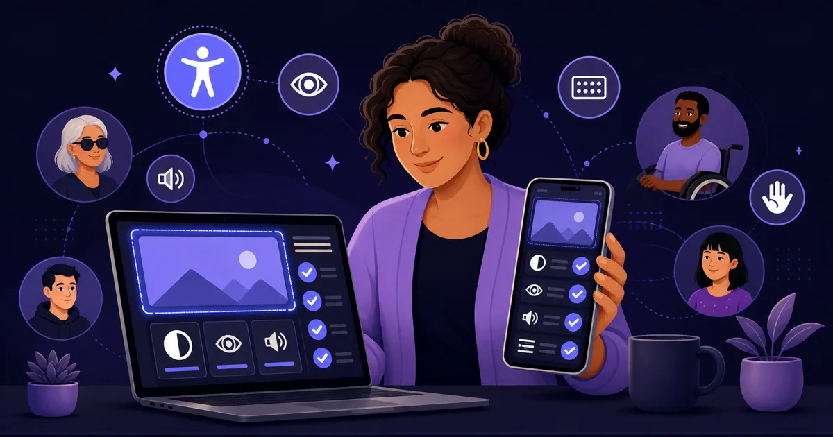
What does website accessibility mean?
An accessible website can be used by people with different needs: visual impairment, motor limitations, colour blindness, cognitive load or temporary situations such as bright sunlight on a phone. WCAG describes four principles: perceivable, operable, understandable and robust.
For small businesses, accessibility is not luxury. Accessible pages are usually clearer, faster and better structured. That helps older customers, mobile users and search engines as well. Many measures are basics: readable type, clear headings, real buttons, alt text and understandable forms.
Who is affected by BFSG from 2025?
Germany’s Barrierefreiheitsstärkungsgesetz (BFSG) implements EU Directive 2019/882 and has applied since 28 June 2025 to certain products and services, including parts of online commerce and consumer-facing digital services. Not every small company website is automatically fully covered, but shops, online contracts and booking flows should be reviewed carefully.
There are exceptions, including for micro-enterprises in some services. Still, “not covered” is not a good reason for a website that people cannot use. Accessibility improves trust and conversion, and it is cheaper to include it during a new build than to repair everything later.
- BFSG application date: 28 June 2025
- Relevant for digital consumer services, shops and booking paths
- Micro-enterprises may be exempt in services — seek legal advice if unsure
- Even without a duty, accessibility improves usability
How do you test contrast and readability?
Open the homepage on your phone and hold it a little further away. Can you immediately read the headline, offer and contact path? Watch for grey text on light backgrounds, thin fonts, tiny buttons and text placed over busy images. WCAG 2.2 often uses contrast guidance of 4.5:1 for normal text and 3:1 for large text.
Use a free contrast checker for navigation, prices, phone numbers, form labels and error messages. If visitors have to zoom, the site is not only less accessible; it also sells worse.
Does the website work without a mouse?
Put the mouse aside and press Tab. You should be able to reach the menu, links, buttons, form fields and booking button in a logical order. It must also be visible where the focus currently is. This focus style is often removed for design reasons, which makes the site hard to use.
Check cookie banners, sliders and pop-ups as well. They must not trap the keyboard. In new website subscriptions we treat these basics as part of quality, not as decoration.
- Logical tab order
- Clearly visible focus state
- Menu, form and cookie banner usable by keyboard
- No keyboard trap
Are images, headings and links understandable?
Screen readers and search engines need structure. Each page should have one clear H1 and logical H2/H3 headings. Headings should be real HTML headings, not just large-looking text.
Images need alt text when they carry meaning: team photos, references, products, rooms or before-and-after examples. Decorative images can have empty alt text. Links should be understandable on their own; “view services for painters” is clearer than “more”.
How accessible are forms and contact paths?
Forms often lose enquiries. Every field needs a visible label, not only placeholder text. Error messages should explain what is missing. Required fields must be clear. Phone numbers and email addresses should be tappable, especially on mobile.
Ask only for what you really need. For many small businesses, name, contact details, a short message and optional file upload are enough. Booking flows should explain confirmation, cancellation and privacy in plain language.
What should you fix first?
Prioritise by impact: first repair anything that blocks contact — menu, buttons, form and phone link. Then improve readability, structure, images and content. Many fixes are small: stronger contrast, restored focus styles, better alt text, proper labels and HTML pages instead of PDF-only content.
If the website is technically outdated or a builder blocks basic changes, a rebuild may be more economical than patching. The key is to treat accessibility as a quality standard from the start.
Frequently asked questions
Does every small business website have to be accessible?
+Can I test accessibility myself?
+What does accessibility improvement cost?
+Is accessibility relevant for SEO?
+Website subscription — from €79/month
Custom web design, German hosting, maintenance and personal support in one monthly package.
Book a free consultation